Neutral colours are timeless. If you enjoy updating your decor with the seasons, a neutral palette can be your biggest ally. It’s the perfect backdrop for effortless updates throughout the year and it’s my favourite thing to do!
The Elegant Appeal of a Neutral Foundation
Creams, beiges, greys, whites and taupes can create a sense of calm and cohesion. They reduce visual stress and serve as a blank canvas for swapping in or out decor or artwork. Use these colours for large areas in the home, and big ticket or hard to change items such as large walls, sofas, kitchen units.
To avoid the space looking flat or dull, designers recommend mixing textures, surface finishes and fabrics in your chosen shades. I personally love mixing in woods and rattan, and adore the combination of velvet and linen together.
You should also note that different neutrals have different base undertones. Some, like sand, have a yellow tone, while others, like taupe, lean more purple. That’s why not all neutrals look right together. Always compare colour swatches carefully when creating your foundation from scratch.
A thoughtful colour palette is essential, especially in smaller homes, such as studio and one-bedroom apartments that range from 300 to 1,000 square feet. A carefully chosen neutral colour scheme makes the space look lighter and larger, psychologically creating more room for your chosen seasonal items.
Once your neutral palette is in place, year-round decor updates can be fun, creative and expressive.
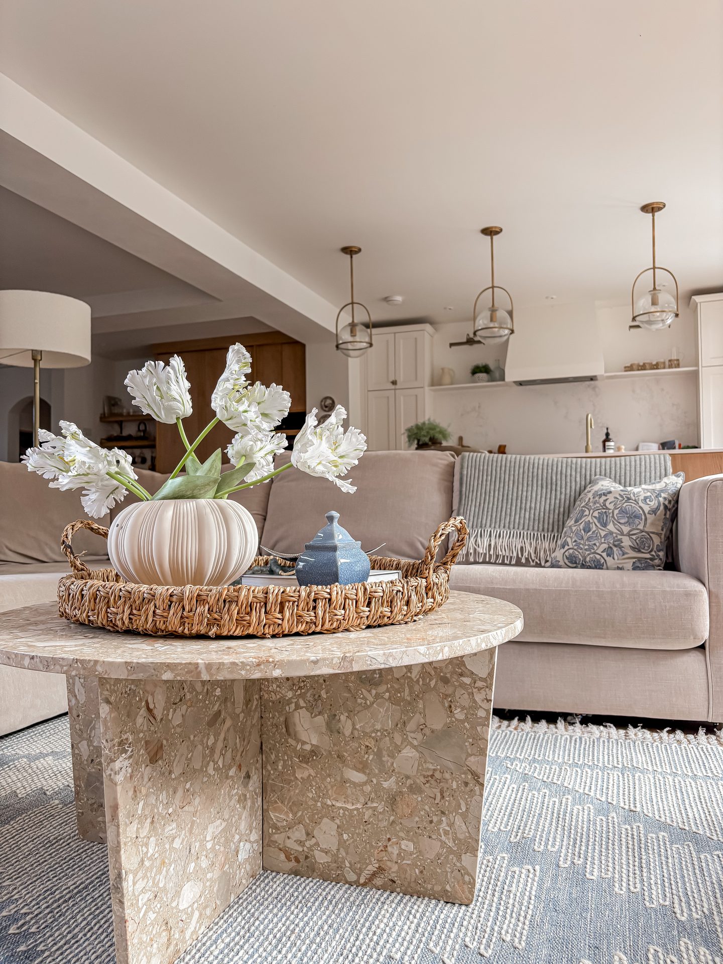
Spring — Fresh and Soft
During spring, you can make your space feel lighter, fresher and full of new energy, mirroring the outdoors. For accent colours, think of dusty rose, pale sage green, soft lavender or a light blue sky.
- Soft furnishings: Replace heavy, dark cushion covers with light-feeling materials, such as cotton or linen, in your chosen pastel accent. Swap out wool or faux-fur blankets for a single lightweight linen or cotton throw.
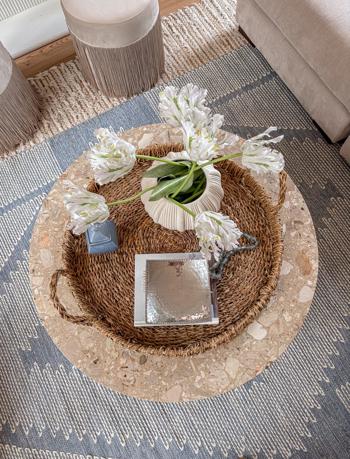
- Florals: Add a simple glass or ceramic vase with a small bouquet of seasonal spring flowers, such as tulips, daffodils or hyacinths. I choose faux versions in key styling areas so they’re permanently there.
- Artwork: Switch out a piece of darker, moodier art for something with a light theme — a simple botanical sketch, a watercolour landscape or an abstract pastel print. I tend to buy quality frames and switch out the artwork as it’s so cost effective.
- Scents: Change your home fragrance to something light and floral, like peony, fresh linen or subtle green tea.
Summer – Light and Natural
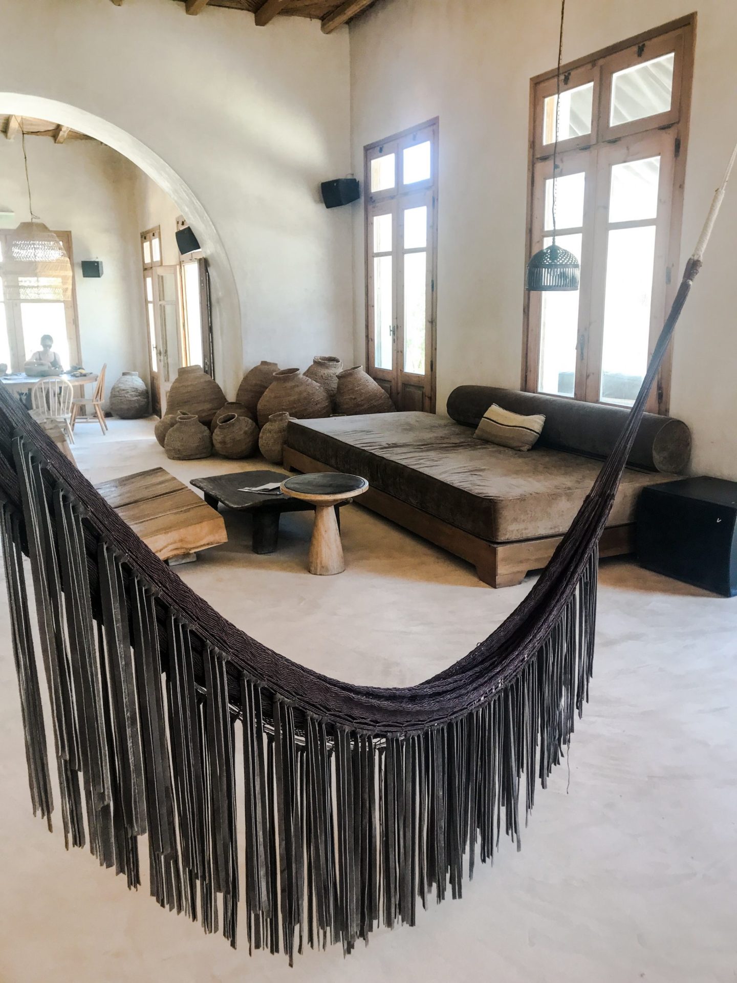
Summer decor should evoke an airy, relaxed feeling, maximizing light and bringing in elements of nature. Let your neutral base shine. Keep the core palette bright and clean and use a single vibrant accent colour sparingly — think a pop of sunny yellow, coral or turquoise. Alternatively, I love the Mykonos vibe which mixes only neutrals and natural elements together.
- Soft furnishings: Switch heavy drapes for sheer, gauzy white or off-white curtains to diffuse sunlight and create an airy feel. On a bed or sofa, use crisp white cotton or linen.
- Textures: Incorporate nature through a woven jute or rattan tray, a light wood bowl for your keys or a large palm leaf in a tall vase.
- Glass: A few vases or drinking glasses in sea blues and greens can catch the light and add a coastal touch without adding visual weight.
- Greenery: Swap floral bouquets for lush, simple greenery like eucalyptus or fern fronds, which are more resilient to summer heat.

Fall — Warm and Cosy
As the weather cools, focus on creating a warm, cosy, inviting sanctuary. Pull in warm, earthy, muted tones against your neutral base. Think of the colours of fall leaves and harvests, such as terracotta, burnt orange, mustard yellow, deep olive green and rich brown.
- Soft furnishings: Layer multiple throws on your sofa or bed. Introduce tactile fabrics, such as cordouroy, bouclé or soft brushed cotton, in your autumn accent colours.
- Natural elements: Use a bowl of pinecones or a vase filled with dried wheat stalks. Go beyond orange pumpkins. They come in a wide array of shapes and colours, including white or black for a sophisticated look that complements your neutral shades.
- Lighting and scent: Use your mantel to display candles with fall aromas and a garland with fairy lights.
- Artwork: Swap out airy artwork for something darker, in colour or subject, to match the darker nights.

Winter — Rich and Inviting
Winter is about creating a sense of rest, depth and quiet luxury, with a touch of festive sparkle. Use deep, rich jewel tones as your accents to create a sense of opulence. A single statement piece in emerald green or deep burgundy can make a powerful impact.
- Soft furnishings: Luxe fabrics, such as velvet and faux fur, can add instant visual warmth and luxury.
- Rugs: Bring back a plush rug for a warm and cosy underfoot feel.
- Lighting: Group pillar candles together or weave micro-LED lights through a bookshelf.
- Metallics: Use metallic accents liberally. A simple bowl of silver ornaments, a gold-rimmed mirror or brass candlestick holders can catch the light and add a festive quality.


Your Canvas for Creativity
A neutral colour palette in your home enables year-round decor to stand out, creating strong visual interest and a real connection to the changing seasons. By choosing neutrals as a base and then introducing carefully curated statement decor, you can blend a spacious, airy feel with a look that feels right all year through. It allows you to refresh your home in a cost effective, creative way, and I’m totally here for it!!
